Blue Couch, Bold Statements: A Practical Guide to Pairing Colors and Textures for Impact

So, you’ve got a killer blue couch. Awesome! That’s a statement piece, right? It’s like the grand entrance of your living room, and now you’re wondering, “Okay, what else goes with this magnificent beast?” I totally get it. Choosing colors and textures can feel like walking a tightrope between chic and chaos. But fear not, my friend, because we’re about to dive deep into making your blue couch the star of the show, surrounded by a supporting cast that absolutely rocks. This isn’t about playing it safe; it’s about making your space sing.
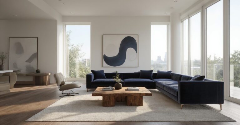
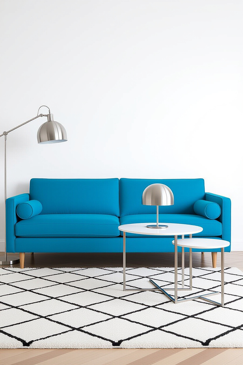
Your Blue Couch: The Foundation of Fabulous
Honestly, a blue couch is a gift that keeps on giving. It’s versatile, from deep navy to bright cobalt, and it sets a tone. But the real magic happens when you start layering. Think of it as your canvas. We’re going to explore how to pair colors that make your blue pop and textures that add depth and interest. Get ready to ditch those beige-and-boring vibes because we’re going for impact.
Beyond Basic Neutrals: Embracing Color Companions
Neutrals are fine, but sometimes they’re just… there. Your blue couch deserves more! Let’s talk about colors that aren’t just okay with blue, but brilliant. We’re going to explore some unexpected pairings that will have your guests asking, “Who’s your decorator?”
The Power of the Complementary Pop
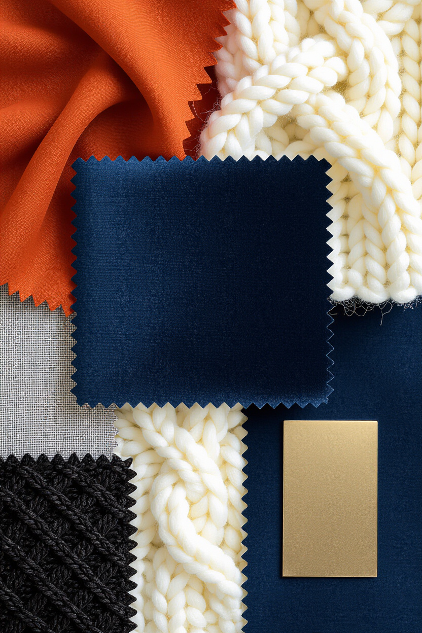
You know how they say opposites attract? In color theory, that’s kind of true! For a blue couch, its direct opposite on the color wheel is orange. Now, before you picture a Halloween nightmare, hear me out. A muted terracotta or a warm, burnt orange can look absolutely stunning against a rich navy. It’s sophisticated, a little unexpected, and incredibly dynamic.
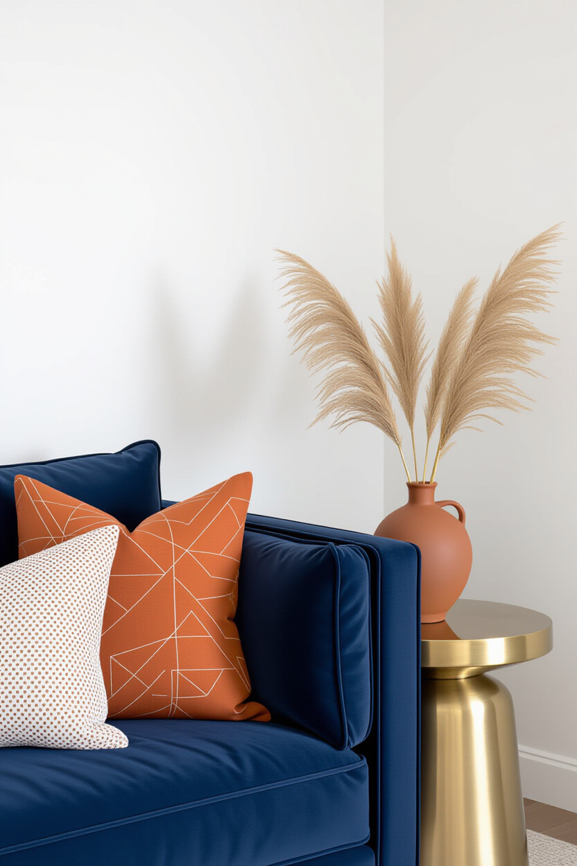
Think about it: that vibrant shot of orange in a throw pillow, a piece of art, or even a small accent chair can instantly elevate the mood of the room. It’s like adding a dash of spice to your favorite dish; it makes everything more exciting. IMO, this is where real personality shines through.
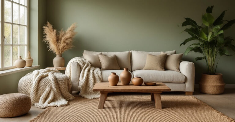
Analogous Harmony: The Soothing Sisterhood
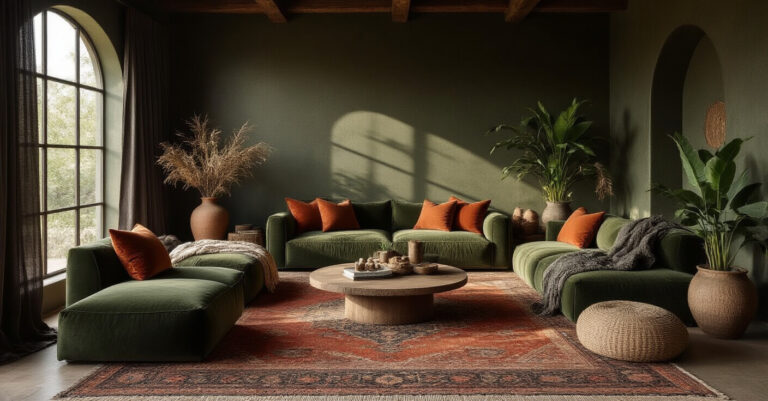
If vibrant pops aren’t your jam, or you’re aiming for a more serene vibe, let’s look at colors that are next to blue on the color wheel: greens and purples. A deep emerald green or a rich teal can create a sophisticated, jewel-toned palette that feels incredibly luxurious. This combination speaks of depth and tranquility.
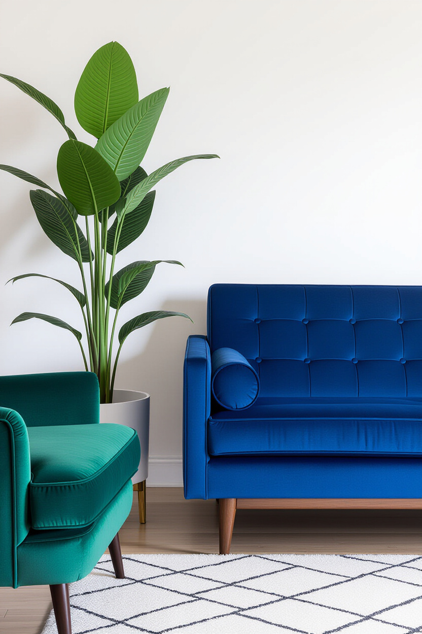
Pairing blue with lilac or a rich amethyst can feel incredibly regal and enchanting. It’s a bit more daring than green, but the payoff is a room that feels unique and deeply inviting. It’s like a secret garden vibe, but make it chic. You’re creating a cohesive, calming atmosphere that’s still full of life.
The Boldness of Contrasting Neutrals
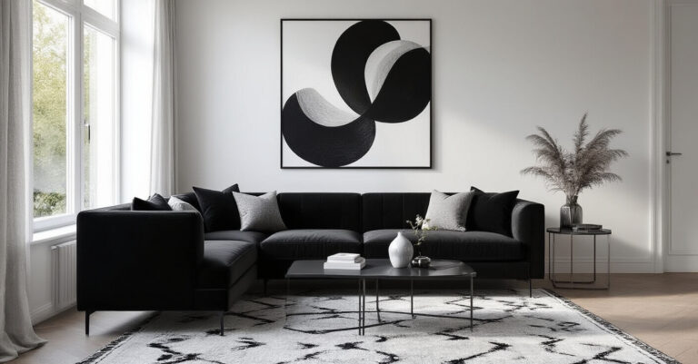
Sometimes, the boldest statement isn’t a loud color, but a confident neutral that plays off your blue. Forget the basic beige; think charcoal gray, crisp white, or even a warm, buttery cream. These aren’t just background players; they become active participants in the design conversation. A strong charcoal can make a vibrant blue feel even more sophisticated, while crisp white offers a clean, modern contrast that lets the blue take center stage.
Cream and buttery tones, on the other hand, add a touch of warmth and softness that prevents the blue from feeling too cool or stark. They create a cozy, approachable feel. This approach is all about balance and refined elegance.
Texture Talk: Adding Tactile Temptation
Color is crucial, but texture? Texture is the secret sauce that makes a room feel lived-in, luxurious, and interesting. A blue couch, especially if it’s velvet or a rich fabric, already brings a certain tactile appeal. We just need to amplify it.
The Plush Factor: Velvet, Suede, and All Things Cozy
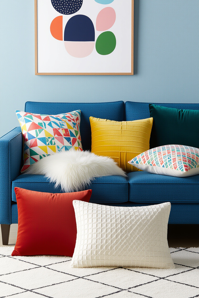
If your blue couch is velvet, lean into that luxurious feel! Pair it with other plush textures like faux fur throws, suede accent pillows, or even a chunky knit ottoman. This creates a sensory experience that’s incredibly inviting. Who wouldn’t want to sink into that?
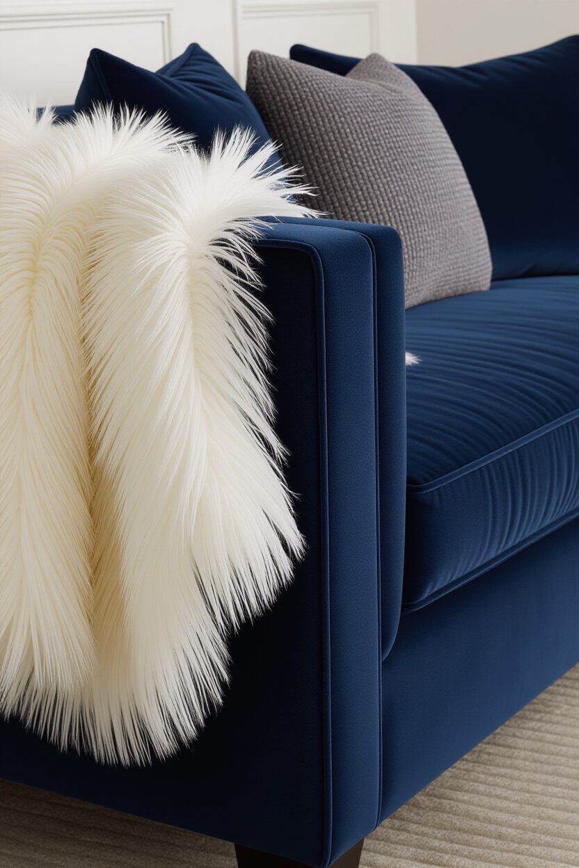
The key here is layering soft, comforting materials. It’s about creating a space where you want to curl up with a good book and a cup of tea. Don’t be afraid to mix different types of softness!
The Rustic Charm: Linen, Jute, and Natural Fibers
On the flip side, if you’re going for a more relaxed, bohemian, or Scandinavian vibe, contrast your blue couch with natural, textured materials. Think slubby linen curtains, a jute rug, or woven baskets. This brings an earthy, grounded feel to the space.
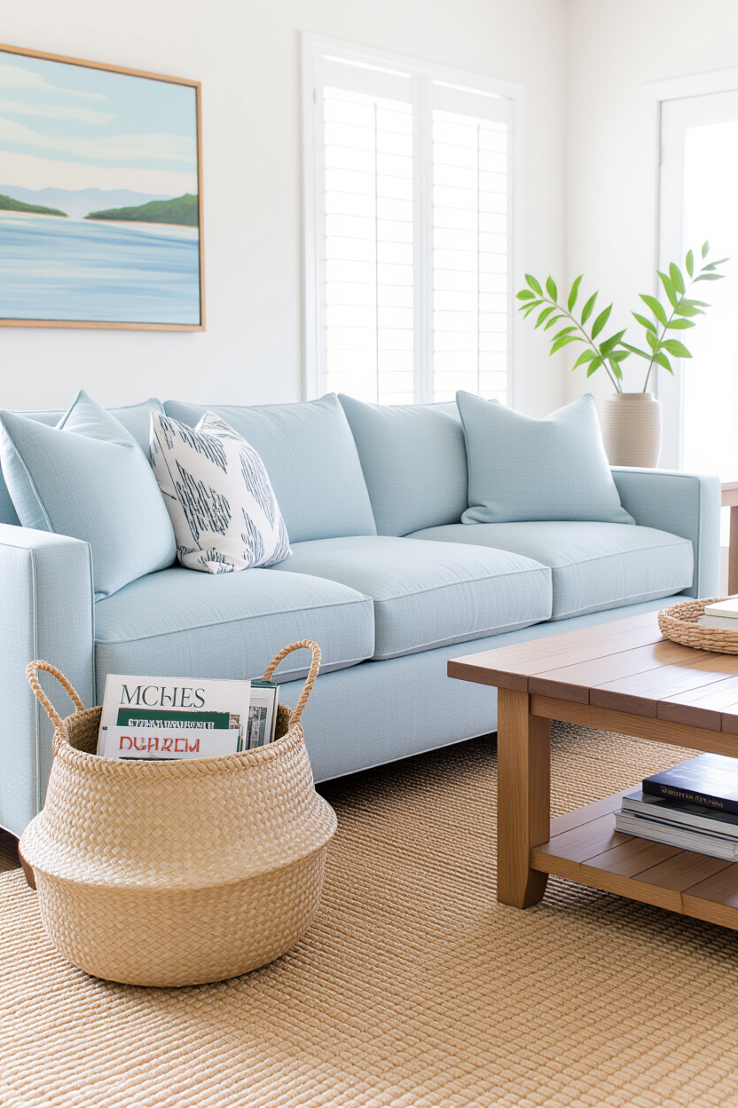
This contrast is fantastic because it grounds the potentially dramatic color of the blue couch. It adds a touch of organic imperfection that feels incredibly authentic and calming. It’s a wonderful way to add visual interest without overwhelming the senses.
The Sleek and Shiny: Metallics and Smooth Finishes
For a more modern or glamorous touch, don’t shy away from sleek, reflective surfaces. Think brushed brass or gold accent tables, a polished chrome floor lamp, or even a mirror with a metallic frame. These elements bounce light around and add a touch of sparkle that can really enhance the depth of your blue couch.
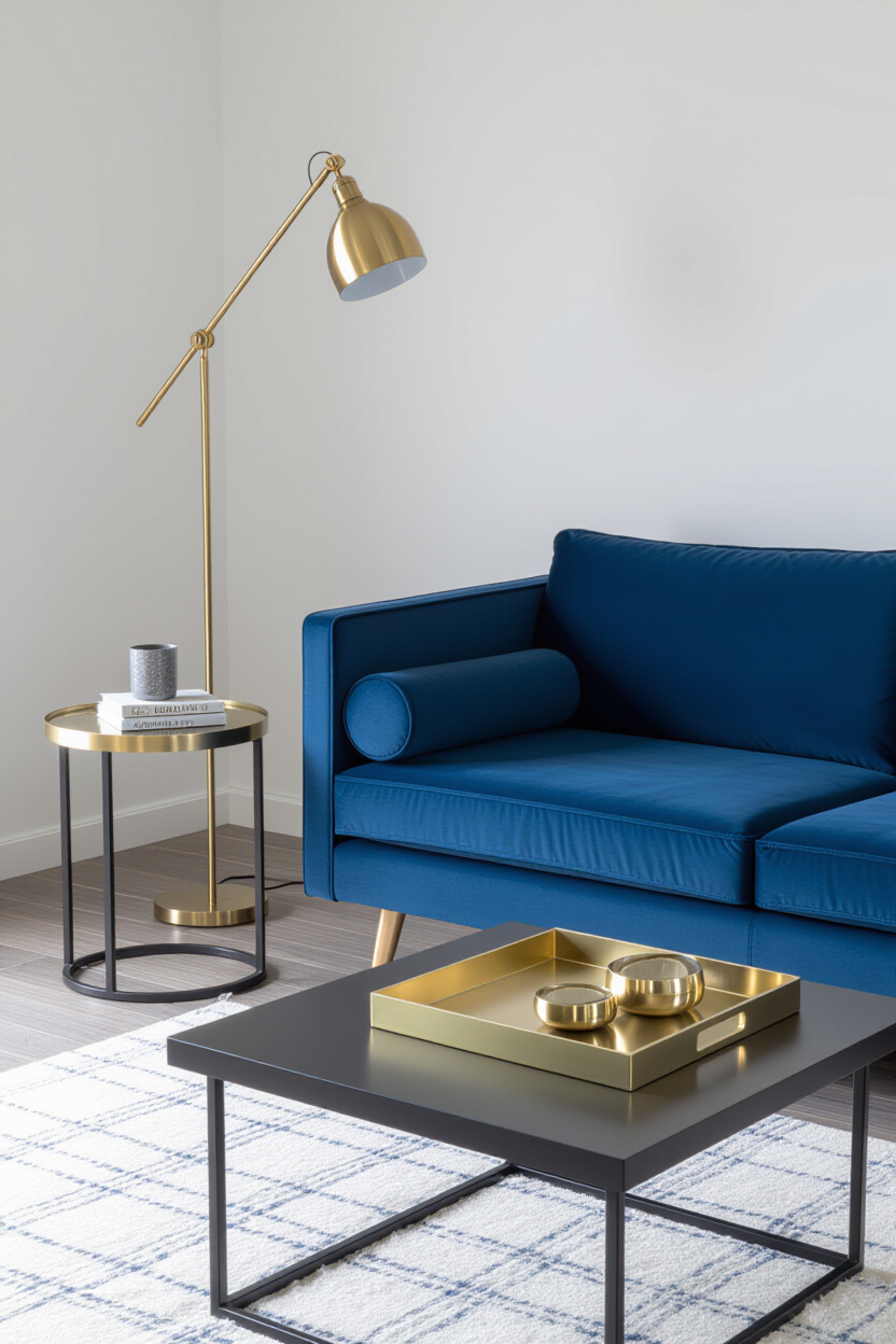
These metallic accents create a sophisticated interplay of light and shadow. They’re not just decorative; they contribute to the overall ambiance of the room, making it feel more dynamic and upscale. It’s that little bit of bling that says, “I’ve got this.”
Putting It All Together: Your Blue Couch Strategy
So, how do you actually do this without it looking like a Craigslist ad went wrong? It’s all about intention and balance.
Start with Your Blue Couch as the Anchor
Whatever shade of blue you’ve got, let it be the star. All your other choices should complement it, not compete with it. If your couch is a deep, moody navy, you might lean into richer, darker accent colors or textures. If it’s a bright, perky cobalt, you might opt for lighter, airier tones and textures.
Think about the overall feeling you want to create: cozy and intimate, or airy and sophisticated? Your blue couch is the starting point, and everything else flows from there. It’s like building a playlist; you start with that one killer track.
The 60-30-10 Rule (With a Twist!)
A classic design principle is the 60-30-10 rule: 60% of your space is the dominant color, 30% is a secondary color, and 10% is an accent color. For us, your blue couch is likely your dominant color (or at least a major player). You can use this as a guideline for your other color choices.
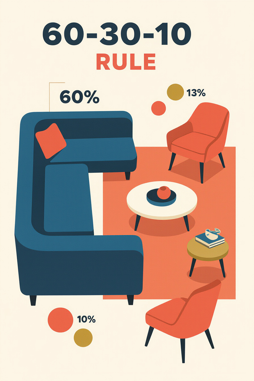
However, we’re adding texture to this equation. So, maybe your 30% secondary color is in a textured fabric like a boucle or a slubby linen. Your 10% accent color could be in a smooth metallic finish or a vibrant, smooth-surfaced object. It’s about distributing color and texture thoughtfully.
Don’t Be Afraid to Experiment!
Seriously, this is the fun part. Grab some throw pillows, borrow a rug, or rearrange some accessories. See what feels right to you. Your home should reflect your personality, and sometimes that means taking a small risk.
What looks good on paper might not feel right in your space, and vice-versa. Trust your gut. If a certain color or texture makes you happy when you look at it, then it’s probably a good fit for your blue couch and your home. It’s your space, after all!
Final Thoughts: Your Blue Couch, Your Masterpiece
Your blue couch isn’t just furniture; it’s an opportunity. An opportunity to create a space that’s visually stunning, tactilely pleasing, and deeply personal. By thoughtfully pairing colors and textures, you transform a great piece into an unforgettable statement. So go forth, embrace the bold, and make your living room a true reflection of you. You’ve got this!