The Psychology of Color: How to Choose Your Living Room Palette for Mood and Style

So, you’re looking to sprinkle some magic onto your living room walls and furniture, huh? Choosing colors can feel like navigating a minefield sometimes, right? One wrong move and suddenly your cozy haven feels like a sterile hospital room or a jarring circus tent. Don’t worry, I’ve been there. But thankfully, there’s a whole science and art to it – the psychology of color! It’s way more than just picking what looks pretty; it’s about crafting a vibe, a feeling, an entire mood for your most-used space.
Let’s dive deep and figure out how to pick the perfect living room palette that screams “you” and makes you feel all the good feels. Ready to ditch the beige boredom and embrace some serious personality?
The Science Behind the Hues: Why Color Matters SO Much
Seriously, think about it. You walk into a room painted a calming blue, and instantly, you feel a sense of peace, right? Then you step into a space with vibrant red accents, and BAM! You feel a surge of energy. Our brains are hardwired to react to colors. They influence our emotions, our perceptions, and even our physiological responses. It’s not just about aesthetics; it’s about creating an environment that supports how you want to live in your space.
This isn’t some woo-woo pseudoscience, either. Psychologists and designers have been studying this for ages. They’ve found that different colors evoke distinct feelings and associations. So, when you’re picking out your living room paint, you’re essentially designing an emotional landscape. Pretty cool, huh?
Understanding the Color Wheel: Your New Best Friend
Before we get too deep into specific shades, let’s give a quick nod to the classic color wheel. It’s your foundational tool for understanding color relationships. You’ve got your primary colors (red, yellow, blue), your secondary colors (green, orange, violet – made by mixing primaries), and your tertiary colors (mixtures of primary and secondary).
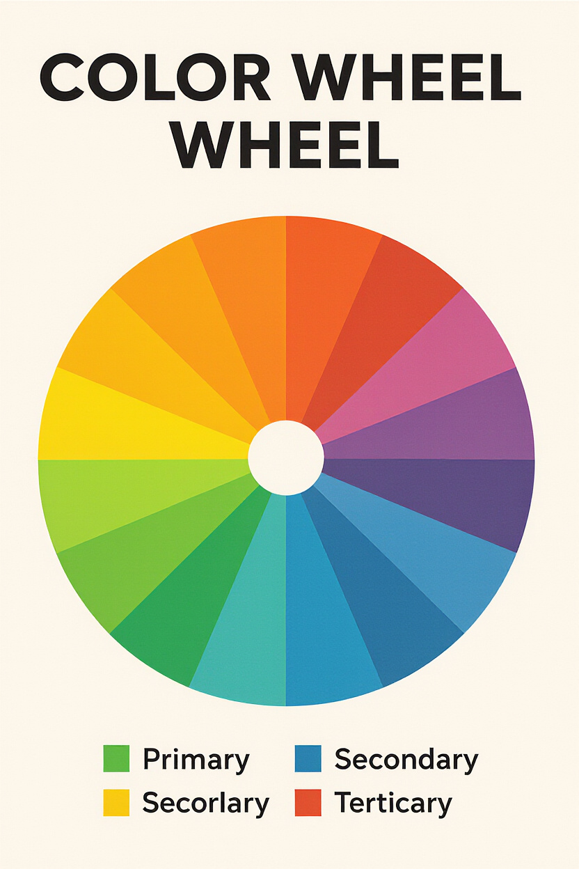
Knowing this helps you understand concepts like:
- Complementary Colors: These are opposite each other on the wheel (like blue and orange, or red and green). They create high contrast and can be really dynamic when used together, but be careful – too much can be overwhelming!
- Analogous Colors: These are next to each other on the wheel (like blue, blue-green, and green). They create a harmonious and calming feel.
- Monochromatic Schemes: Using different shades and tints of a single color. This creates a very sophisticated and cohesive look.
Setting the Mood: What Vibe Are You Going For?
This is where we get personal. What do you want your living room to feel like? Is it your sanctuary for unwinding after a long day? Is it the go-to spot for lively dinner parties and movie nights with friends? Your desired mood dictates your color choices, plain and simple.
For the Calm and Cozy Seeker
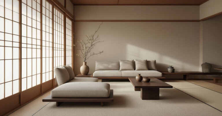
If you dream of sinking into your sofa with a good book and a cup of tea, you’re probably after a calming and serene atmosphere. Think soft blues, muted greens, earthy browns, and gentle grays. These colors have a natural ability to lower stress levels and create a sense of tranquility.
- Blues: Evoke feelings of peace, stability, and trust. Lighter blues can make a room feel airier, while deeper blues can feel more sophisticated and grounding.
- Greens: Remind us of nature, bringing in a sense of renewal and balance. Sage green, mint green, and olive green are all fantastic choices for a relaxed vibe.
- Neutrals: Think creams, beiges, and soft grays. These are the ultimate background players that allow other elements to shine, while still offering warmth and comfort.
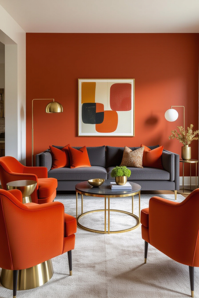
For the Energetic Entertainer
Hosting is your jam! You love a lively atmosphere where guests feel welcomed and energized. Bold colors, warm tones, and rich hues are your friends here. These colors can stimulate conversation and create a vibrant, engaging space.
- Reds & Oranges: These are stimulating colors that can increase excitement and warmth. Think terracotta, burnt orange, or even a deep, rich crimson for accents.
- Yellows: Sunshine in a room! Yellows can bring cheerfulness and optimism, but use them thoughtfully. Too much bright yellow can be overwhelming. Softer, buttery yellows are often a safer bet for larger areas.
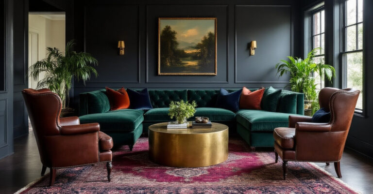
- Jewel Tones: Deep emerald greens, sapphire blues, and ruby reds can add a touch of luxury and drama, perfect for a more sophisticated, yet still energetic, gathering space.
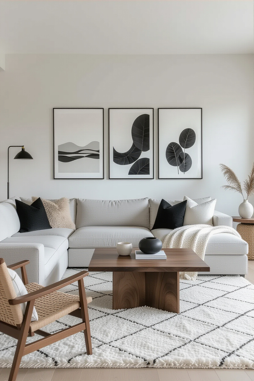
The Power of Neutrals: Don’t Call Them Boring!
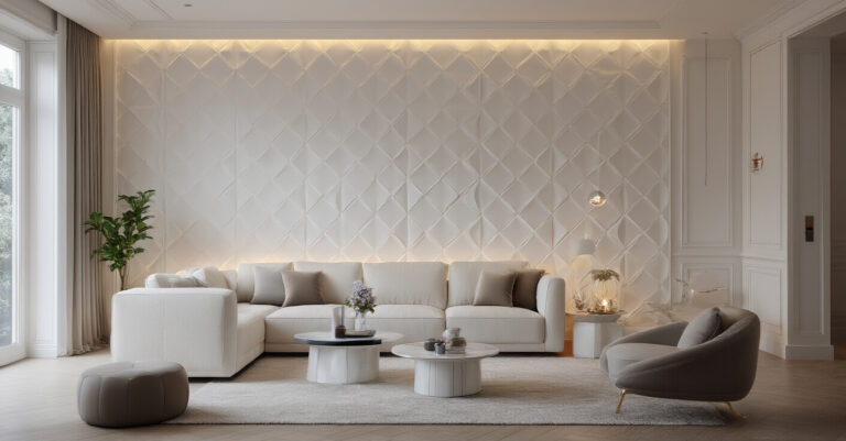
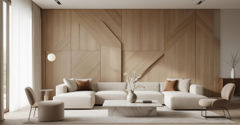
Okay, I know what you might be thinking: “Neutrals? That’s just code for boring!” And to that, I say, ridiculous! :] Neutrals are the unsung heroes of interior design. They’re incredibly versatile and can create sophisticated, layered looks that are anything but dull.
The trick with neutrals is to layer textures and varying shades. A room with just one shade of beige can indeed be a snooze-fest. But a room with a creamy white sofa, a light grey rug, a charcoal accent chair, and textured linen curtains? Now that’s a whole different story.
Beyond Basic Beige: Exploring the Neutral Spectrum
- Whites: Not all whites are created equal! You’ve got crisp, cool whites that feel modern and airy, and warm, creamy whites that offer a softer, cozier embrace.
- Grays: From light, airy dove grey to deep, dramatic charcoal, grays offer a sophisticated backdrop. They pair beautifully with almost any accent color.
- Beiges & Tans: These warm neutrals bring an earthy, organic feel to a space. Think of sandy tones, warm taupes, and rich caramels.
The 60-30-10 Rule: Your Secret Weapon for Balance
This is one of those game-changing design principles that makes choosing a palette SO much easier. It’s called The Rule of Three, or more commonly, the 60-30-10 rule. It’s a simple guideline for distributing your colors to create visual harmony.
- 60% Dominant Color: This is your main color, usually used on walls or larger furniture pieces. It sets the overall tone of the room.
- 30% Secondary Color: This color supports your dominant color and should be about half the amount of your main shade. Think accent chairs, curtains, or a smaller sofa.
- 10% Accent Color: This is your pop! Use it for smaller accessories like throw pillows, artwork, or decorative objects. This is where you can have the most fun and inject personality.
When you follow this rule, you automatically create a balanced and pleasing aesthetic. It prevents one color from overpowering the others and ensures everything flows nicely.
Bringing It All Together: Color and Style Synergies
Now, how do you weave your chosen color palette into your existing living room style? This is where the fun really begins, as color and style are intrinsically linked.
Modern & Minimalist Living Room Colors
If sleek lines and uncluttered spaces are your jam, think clean, crisp colors.
* Dominant: White, light gray, or a soft, muted blue.
* Secondary: Black, charcoal, or a deep navy.
* Accent: A subtle metallic (like brushed nickel or chrome), or a single pop of a bold color like emerald green or deep teal.
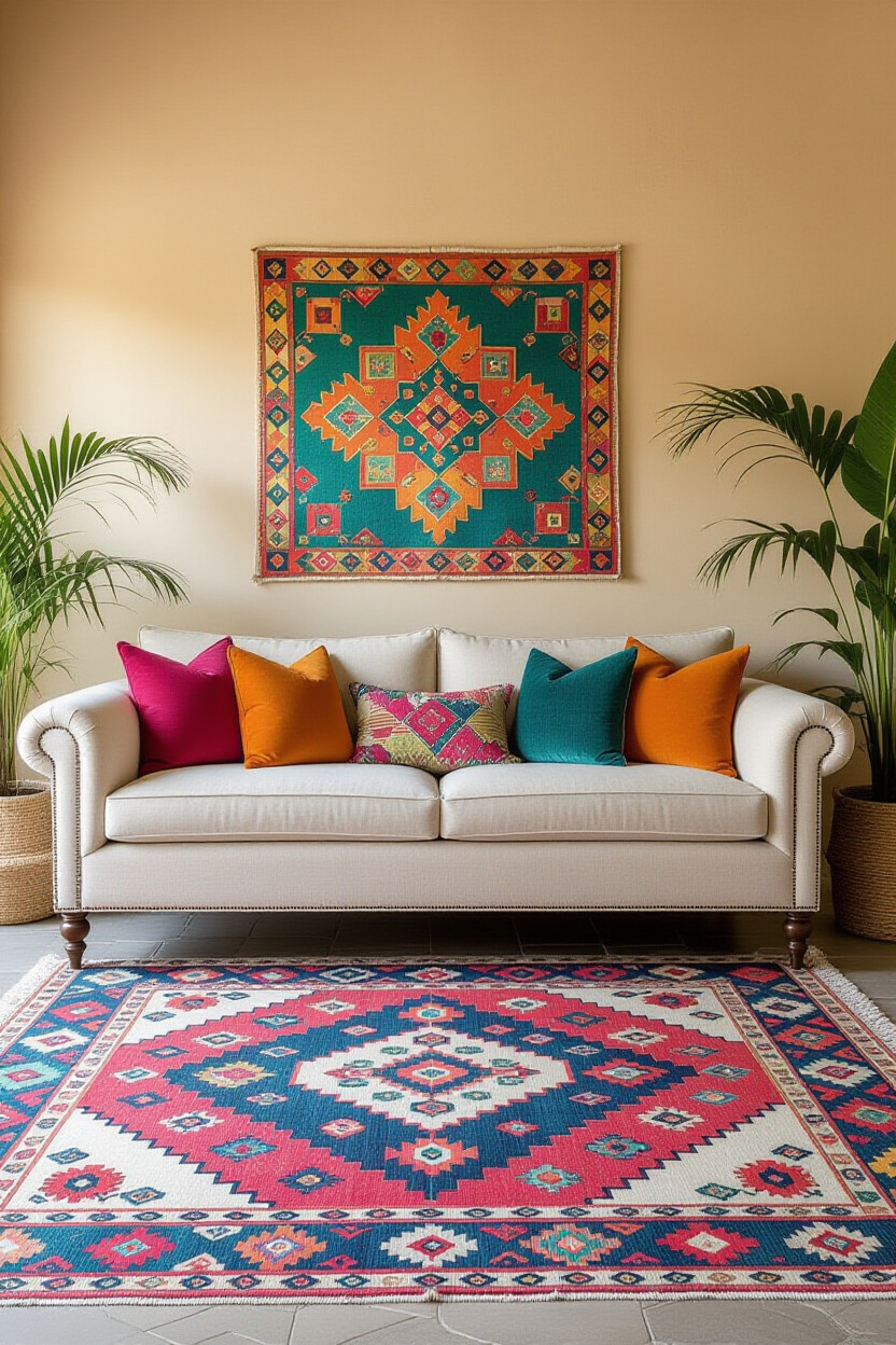
Boho & Eclectic Living Room Colors
Embrace a more relaxed, layered look with a mix of warm, earthy tones and vibrant pops.
* Dominant: Cream, beige, or a warm terracotta.
* Secondary: Mustard yellow, olive green, or a dusty rose.
* Accent: A riot of color through patterned rugs, global-inspired cushions, and colorful artwork. Think oranges, reds, and even some deep purples.
Mid-Century Modern Living Room Colors
Think warm woods, clean lines, and a touch of retro flair.
* Dominant: Teal, olive green, or a warm, muted orange.
* Secondary: Cream, white, or a light grey.
* Accent: Pops of mustard yellow, burnt orange, or even a rich, dark brown.
Traditional & Classic Living Room Colors
Opt for timeless, sophisticated shades that exude elegance.
* Dominant: Cream, ivory, or a soft taupe.
* Secondary: Deep blues, rich burgundies, or forest greens.
* Accent: Gold, brass, or a subtle pattern with a contrasting border.
Don’t Forget the Light! It Changes EVERYTHING
FYI, the lighting in your living room dramatically impacts how colors appear. Natural light is your best friend – it’s consistent and reveals colors truest. However, most of us rely on artificial light, and that’s where things can get tricky.
- Warm lighting (yellowish tones): This will make colors appear warmer and can enhance reds, oranges, and yellows. It’s great for creating a cozy atmosphere.
- Cool lighting (bluish tones): This will make colors appear cooler and can enhance blues and greens. It’s often used in more modern or task-oriented spaces.
Before you commit to that gallon of paint, paint swatches on different walls in your living room. Observe them at different times of day and under your usual lighting conditions. Trust me, you’ll be surprised at how much the color can shift!
Testing Your Palette: A Practical Approach
So, you’ve got a general idea of the mood and style you’re going for. Now, let’s get practical.
Start Small, Think Big
Don’t dive headfirst into painting your entire living room in a bold, new color without a test run. Start with accessories!
- Throw pillows: These are your color playground. Grab a few in different shades and see how they feel against your existing furniture.
- Artwork: A piece of art can be the perfect jumping-off point for your color scheme.
- Rugs: A rug can tie a whole room together and introduce a significant amount of color and pattern.
The Paint Swatch Ritual
Once you’re feeling confident, it’s time for the paint swatches. Get a few small sample pots of your top color contenders.
- Apply generously: Paint large squares (at least 1ft x 1ft) on different walls of your living room.
- Observe: Look at them in the morning, afternoon, and evening. See how they interact with your furniture and decor.
- Live with it: Seriously, give yourself a few days to see how you feel about them. What might look amazing for five minutes could drive you bonkers after a week.
Final Thoughts: Trust Your Gut!
Ultimately, the psychology of color is a guide, not a rigid set of rules. The most important thing is that your living room feels like you. It’s your personal sanctuary, your space to relax, entertain, and just be.
So, experiment, play, and don’t be afraid to break the “rules” if it feels right. Your living room should be a reflection of your personality and a place that brings you joy. Now go forth and color your world!